A selection of graphical and digital projects I’ve designed recently including logos, posters and websites. A wider selection of my design work can be seen at www.jjwdesign.co.uk. Please don’t hesitate to get in touch if you have a project in mind. I’m friendly, approachable and always happy to discuss work further.


Kirby Lonsdale
Project: Door designs for two refurbished toilet blocks
I entered a competition to design more toilet doors and won! It seems to becoming a niche market. Never the less it’s great to develop the designs further and get them printed at scale. The brief was to brighten up two neglected blocks with local land marks.
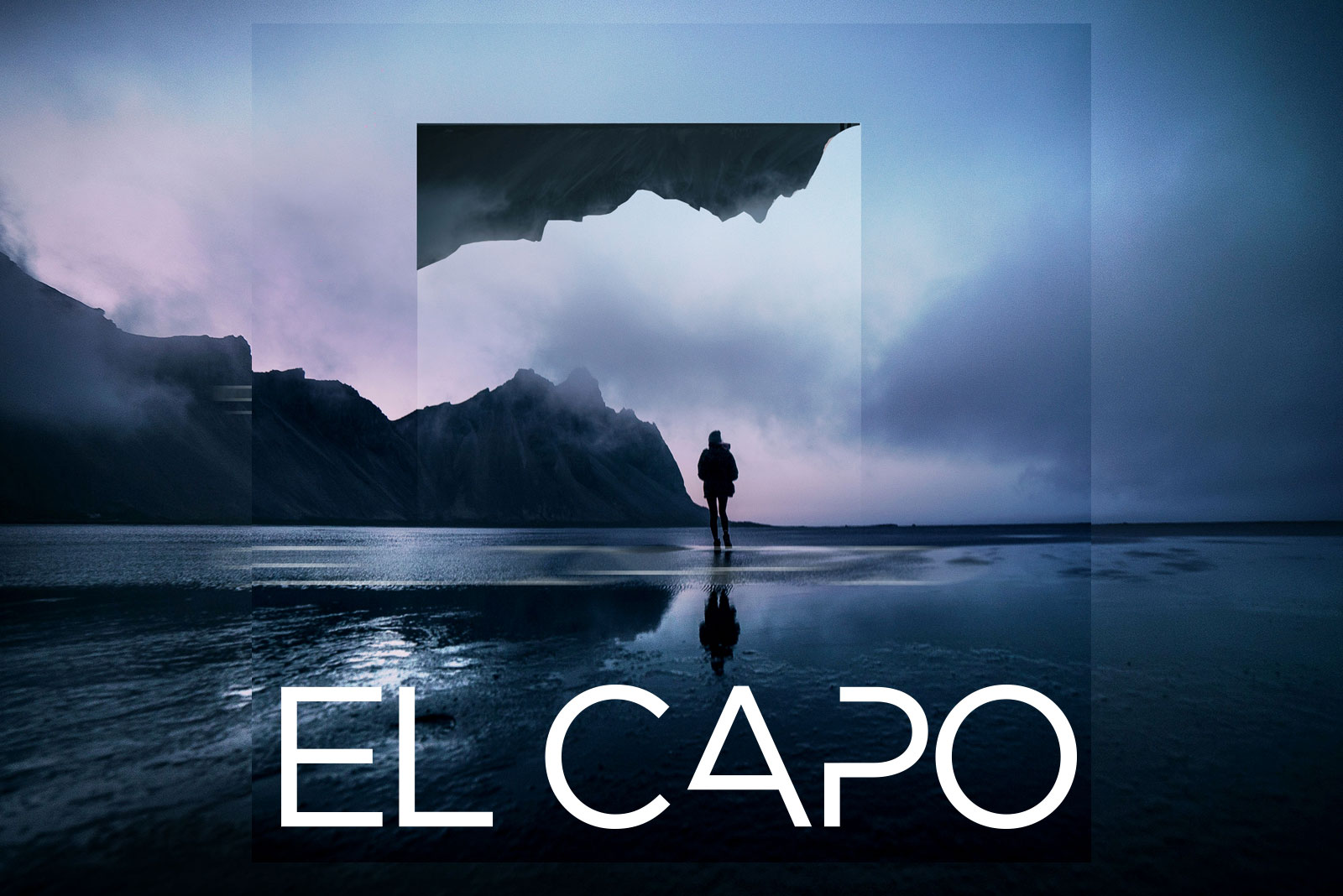
EL CAPO
Project: Music brand for social media
It’s always a pleasure to design a logo especially a music logo. I started off designing music flyers back in the lively 90’s. El Capo is a music producer based in the North West of England. He wanted something contemporary combined with a slight heritage feel as a nod to his early house music recording past. Evocative landscape photography from around the world combined with an edited Gotham font logo created a simple yet powerful brand.
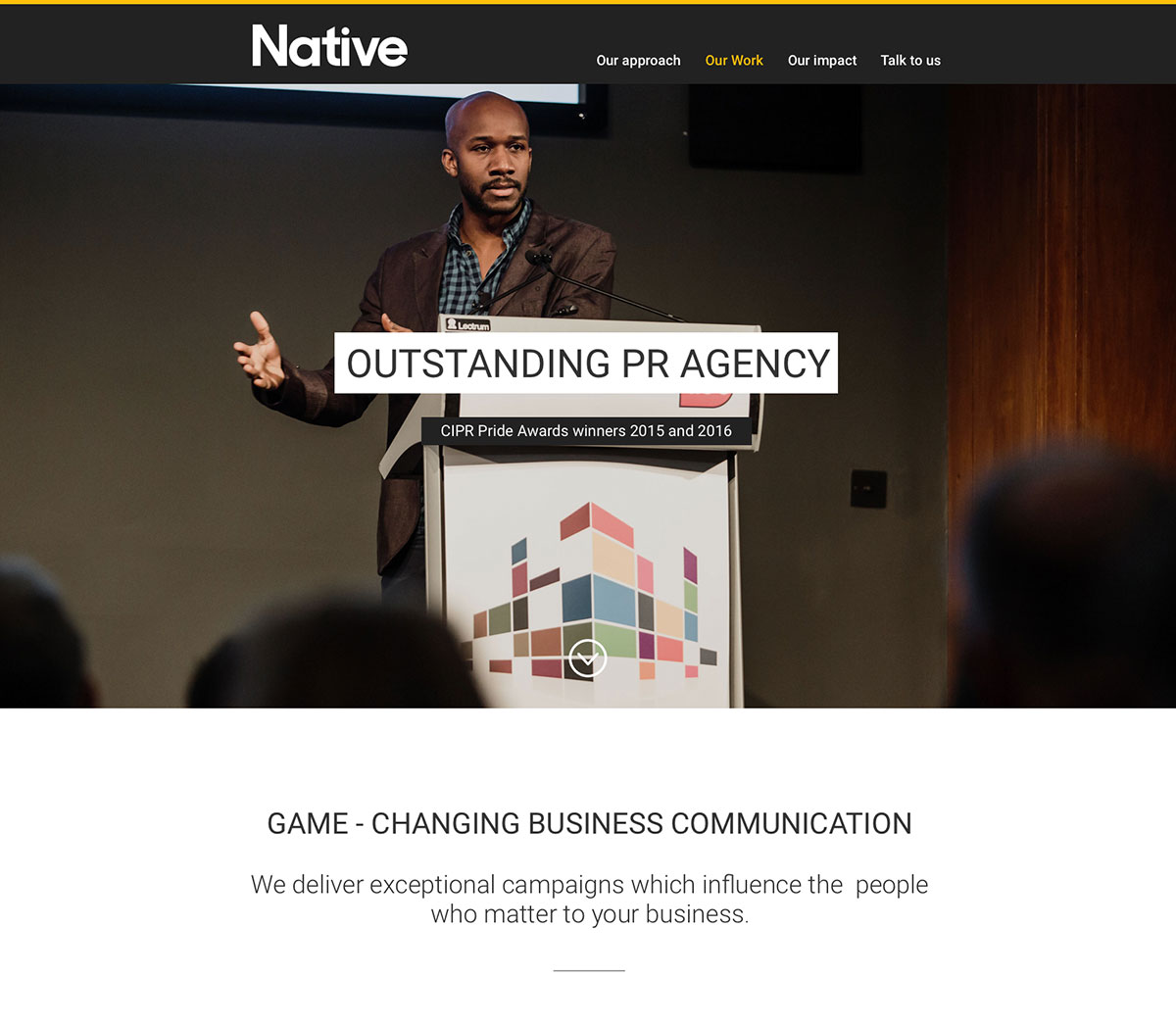

NATIVE
Project: Brand & webdesign
Native are a respected PR agency. I was asked to redesign their website and update their branding. The existing logo was in uppercase and looked heavy and stark. I developed a softer looking logo in Sharp Sans to create a more contemporary and approachable look and feel. The colour palette was extended using a warmer yellow accented with a blue and greys. The website was designed to be responsive, clean and simple using a one page design layout.


WILD HUMAN
Project: Brand
Wild Human is an outdoor brand that offers holistic courses and retreats based around traditional outdoor skills and ancestral movement strategies. I was asked to design a brand look and feel. After exploring ideas of wilderness I eventually decided upon the typeface Din combined with a stags antler. I found that words distorted using the antler created a modern yet also edgy look and feel. The logo had to appear strong, but not too masculine. A softer look could be achieved by combining the logo inverted and in white with the great photography supplied. The brand is growing with a full website to be launched this year.

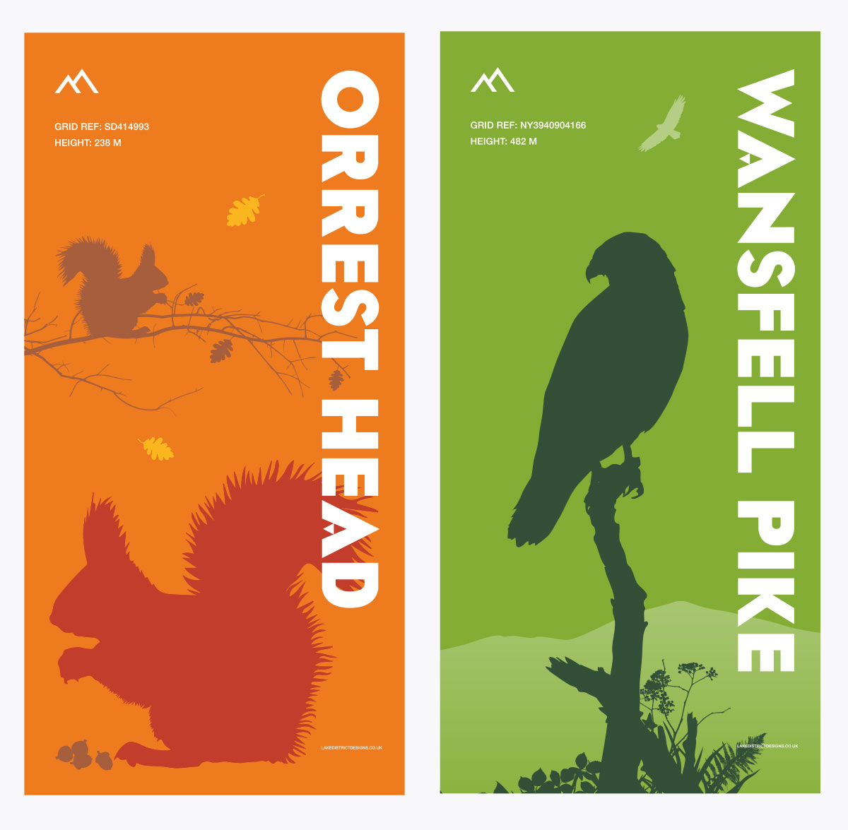
QUARRY RIGG WINDERMERE
Project: Door graphics
I was asked to brighten up some neglected public toilets in Windermere which were to be refurbished. The brief was to promote local beauty spots and highlight the wildlife in the South Lakes. The vector designs will be placed over bespoke fabricated steel doors with an anti-graffiti laminate.


LAKELAND
Lakeland is a chain of kitchenware stores in the United Kingdom. I was asked to redesign the homepage incorporating the new more confident branding. I developed a flexible layout that allowed key products to be displayed cleanly and simply higher up the page while accommodating editorial and lifestyle content further down. The navigation was updated with new icons and included a larger search area after UX input. The hero area uses a full width band of colour which creates a flexible base for the vast array of product photography.

R M SHEA LOGO & BUSINESS CARDS
A carpenter and decorator wanted a logo that was clean, simple and yet slightly sophisticated. He also wanted to push his New Zealand heritage. A selection of symbols were created as a logo set that could be intermixed when desired, particularly for social media. Old yet beautiful tools including the plane and the drill where developed for the reverse of his business cards to demonstrate his skill as a carpenter. The fern motif depicted his kiwi roots yet also hinted as his passion for nature and of course wood.


GEORGE FISHER WEBSITE
The George Fisher website was dated and inefficient as an ecommerce platform with limited sales conversions. The brief was to update the sites design, ensure the buying experience was simpler and make the site responsive. I developed a clean and fresh looking design that utilized large hero photography to showcase Keswick and the beautiful Lake District. Product shots were standerdised on a white background to make browsing the shop easier. Social content including interviews and videos were combined with shop items to keep content fresh and engaging. The live site only reflects part of the design concept and thinking unfortunately.

ROMAN GIFTWARE
Hadrian’s Wall is a UNESCO world heritage site built by the Emperor Hadrian in AD 122 to mark the boundary of Roman rule in Britain. I designed some concepts for a giftware range which focused on some of the most important forts along Hadrian’s Wall and some of the legions responsible for its construction.
BRIDAL VENUES LOGO
A new logo for a Bridal Venues website. This is a portal for some of the best and most popular wedding hotels/venues in the Lake District. Couples can search for a specific venue see reviews, pictures and ulimately contact the venue to arrange a visit. The client wanted something clean and simple that depicted both weddings and the Lake District.